article library
If you are looking for inspiration and instruction for painting in watercolour you may find the ‘How To Guides’ we have written for the Artist and Illustrators magazine useful. Browse the list below and click through to their site for the full article. We hope you find them inspiring!

“Glowing Daffodils” Siân Dudley Watercolour
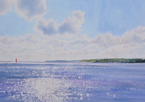
Natural Light: Why it pays to be patient.
‘The right sort of light transforms the mundane into the marvellous, motivates creativity and results in flurries of artistic activity. Even the most simple artefacts can be inspiring if the light hitting it is “just right”, enhancing the shape, structure, colour or setting. Sadly, natural light is hugely variable, not something that can be manipulated at will. We can get lucky, but we cannot make it “just right”, as and when we want it to be. What we can do, however, is change how we respond to it. Good observational skills are essential, yet so is patience.’
An A & I ‘How To’ Guide
A & I Issue 419

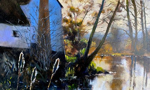
Winter Landscape in Watercolour. Rob Dudley.
How to Paint a Winter Landscape in Watercolour
‘Winter might not have a reputation as being the most colourful of seasons. It lacks the showiness of autumn, the vibrancy of spring and the sheer variety of summer greens. Nevertheless, I believe winter offers as spectacular a range of colours as any of the other season – if you know when and where to look.’
An A & I ‘How To’ Guide
A &I Issue 412

Siân Dudley : A watercolour step-by-step.
How to Paint a Woodland Glade
‘As we walked around a bend, I was greeted with a magical scene: a cool tunnel formed by trees growing across the path, with a wonderful, beckoning glow of light beyond. I was particularly inspired by the shapes of the trunks and branches that twisted and turned into fascinating shapes. The glow on the grasses beyond highlighted the negative shapes between the trunks and it was this effect that made me want to capture the scene in a painting.’
An A & I ‘How To’ Guide
A & I Issue 409

Autumnal Reeds Rob Dudley Watercolour
How to Create Effects with Masking Fluid
‘Probably the simplest use of masking fluid is to protect the white of the paper from subsequent washes. However, I also like to use it in combination with other techniques, which allow me to create some interesting and unexpected effects within my paintings. A particular favourite is one that I call “mask and lift”. As the name suggests, it involves both the masking of selected parts and the lifting of paint from around the masked sections.’
A & I Issue 407

Tomatoes and Basil Siân Dudley watercolour
How to Paint a Still Life in Watercolour
‘When beginning this still life watercolour demo, I struggled to find inspiration – a point I am happy to share, as many students have told me they find it comforting to know it happens to all of us. Then I noticed sunlight streaming through the window, lighting up a pot of basil and some tomatoes, and I was reminded of a Patrick Heron painting in vibrant reds and greens, so beautifully balanced in colour and tone. Here were the inspiring subjects, right under my nose.’
A & I Issue 405

Shadowy Lane Rob Dudley Watercolour
How to Paint Shadows in Watercolour
Shadows can help bring harmony to a painting’s composition, but for an authentic look, careful colour mixing is key.
A & I Issue 369
‘Freshening For the West’ Rob Dudley Watercolour
How to Plan a Watercolour Painting
It is always tempting to just start laying down watercolour on a blank page but a more methodical approach can actually allow you more freedom to paint.
My planning starts right at the point of the initial inspiration. I question myself about the reason why I was inspired, asking, for example, what caused me to stop at that point on my walk? Why do I want to paint this particular scene? Do I want to capture an image of the place, or the atmosphere at the particular time of day, or a mood caused by the weather conditions? Why did I find the way that the light fell on the open fields so exciting?
A & I issue 306

‘Netton Breakers’ Rob Dudley Watercolour
How to use the drybrush technique
I find a drybrush stroke is one of the most useful in my armoury of watercolour brush techniques, often employed to convey the texture of wood, flaky paintwork, distant hedgerows or foreground grasses.
In Netton Breakers (top) I used multiple layers of drybrush to suggest the texture of the rocks, making sure that each layer was completely dry before the next was added.
An A & I ‘How to Guide’
A & I issue 363

Tonal Indicator Tool Siân Dudley
The Tonal Indicator Tool - Identifying Tonal Differences
It is possible to overrule perceptual constancy and our perceptions about colour by isolating small areas of your subject. By taking an area out of context, your brain is fooled into breaking any associations it might have with the subject as a whole. Instead, it perceives it for what it is – a spot of colour and tone. Here’s how to use it…
A & I issue 295

A BEGINNERS GUIDE TO PAINTING FLOWERS IN OIL
When first approached to do this piece I was quite excited by the idea. I haven’t painted oils for years, so long I had forgotten why I stopped. As soon as I opened the tube, I remembered. They are smelly, sticky, and difficult to clean, which given my aptitude for making a mess, is not a good thing. Fearing a clean-up operation of some magnitude, I rang the editor and asked for permission to swap to water mixable oils. Thankfully, she agreed.
A & I Feb 2018
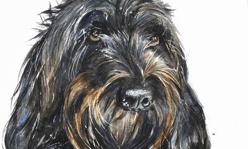
How to Paint Dog Fur
We Brits love our pets, and for many of us who love to paint, a pet portrait seems the perfect fit. For watercolourists, however, painting hair or fur is a daunting prospect; capturing the texture and highlights of hair and fur when working from light to dark is tricky, to say the least.
With the help of Molly-Mou, and her delightful mix of doggy wool and hair, I hope this demonstration will give you the confidence to try it for yourself, assuming you can get your pet to ‘sit’ for long enough!
A & I issue 366

How to Choose Watercolour Paper
When I teach I am always asked which paper I am using. The real question we should be asking is why I made that particular choice for that particular painting. There are three main categories of surface texture: rough, cold-pressed (or NOT) and hot-pressed (HP).
When planning a new picture, begin by considering your subject matter and the manner in which you want to paint it. Make a considered choice of surface texture…
A & I issue 362

How to Choose your colour palette
What is a ‘restricted’ palette?
Simply put, this means choosing as few paint colours as possible with which to complete your painting. I tend to think of all the colours I own as my ‘total’ palette. My ‘basic’ palette therefore consists of my favourite colours; about 23 tubes that I use most often and know very well. However, even this is too broad so for each new painting I work with a ‘restricted’ palette, choosing only those colours I really need. Choose your colours correctly, however, and you can achieve as many different colours in your painting as you need.
A & I issue 350

how to look after your paint brushes
Like many artists, I am very attached to my brushes. I love them all individually and I’m very familiar with their individual characteristics. I can distinguish between brushes of the same make, series and size. I know their degree of spring, their shape, their balance, and, most importantly of all, the marks I can make with each of them.
I rely on my brushes to behave consistently in producing marks that are indicators of my style and individuality as a painter…
A & I issue 313

How to know when your painting is finished
Ok, you’ve been inspired, the painting has been planned, the process enjoyed, the image you had in mind is nearing completion and developing nicely before your eyes. You are nearly there but the big question you need to ask yourself is: when do you stop?
Sometimes it’s clear – you just know that the next brushstroke will be the last; the image will be complete. But more often than not, making the decision to stop working on a painting is very difficult…
A & I issue 308

Dictionary of Marks
When we learn to write, we begin by learning to shape letters. We then join these together to form words, then words form sentences, sentences form paragraphs and paragraphs form stories. After all, we wouldn’t dream of expecting someone learning a new language to start by writing a novel!
The act of simply colouring in shapes with washes doesn’t allow opportunity for the medium itself to be fully exploited. Controlled washes are essential but watercolour is an exciting medium, which, with a little experimentation, can be made to work for you. By developing the painterly equivalent of these ‘letter shapes’, you will find an enormous alphabet of exciting marks that you can use to create your own vocabulary.
A & I issue 305
How to See Tone
Due to the vagaries of the English language, ‘tone’ is an often misunderstood word, especially when used by artists, yet its meaning is very straightforward.
Tone simply refers to how light or dark a colour appears to be. The importance of using the correct tonal qualities in a painting should not be underestimated.
Get it wrong and your painting will appear to be flat and lifeless; get it right and your work will sing! I
A & I issue 295

how to Fix Mistakes in Watercolour
Weeds are only flowers growing in the wrong place, and although this means they can inhibit the growth of cultivated plants, it doesn’t make them less beautiful.
With this in mind, I would like to introduce you to ‘watercolour weeds’. ‘Watercolour weeds’ is a term I use to describe marks that have happened unintentionally; in other words, paint in the wrong place. I have met many people who are under the impression that once a mistake is made with watercolour, there is nothing that can be done about it and they tear it up, put it in the bin and start again. This is simply not the case…
A & I issue 300

How to Create texture in watercolour
This project will help master the crucial skill of watching paint dry… and thereby teach when to apply more paint and how much water to use! The project also offers the opportunity to consider ways of applying the paint, and the effect that layering paint has on the texture and colour of a finished piece.
A & I Issue 303
The Hay Wain : How to reinterpret a mastrepiece
The Hay Wain is one of the best-known paintings in Britain. And therein lies the problem.
It is very difficult to study Flatford Mill millpond and Willy Lot’s cottage landscape with a view to painting it without having a mental image of The Hay Wain overlaying what you are looking at. There is also the knowledge that your audience will undoubtedly compare your work to that of the great man himself. Daunting thoughts. So, how do you prevent your painting being overly influenced by the original?
A & I April 2021
The Artists and Illustrators Magazine
Sian and Rob contributed to the Artists and Illustrators (A & I ) magazine over many years. The A & I is the UK’s most popular magazine for practising artists. It has something for artists at all stages in their creative journey, and is equally relevant to to professionals, aspiring amateurs and those who paint purely for pleasure. It is an inspiring read! It has been a pleasure to write for them.
In order to keep their website fresh the Artists and Illustrators magazine change which articles are displayed. We check regularly to make sure the links above are still live, but if you notice before we do that an article is not currently visible, we would be grateful if you could let us know. Contact Us