SpRING Term week 4
Date: 30th & 31st January 2024
Tutor: Rob
Free painting
what to bring
You usual painting materials and your current project.
IMPORTANT NOTICE
The next classes, February 13th and 14th, are during half-term. This is a change from our original timetable for the term, when we had planned session 5 to be a tutor led lesson. Please could you check your diaries before coming this week and let us know if you are not able to attend either of these classes. If numbers are low we may change the tutor led session to session 6, on 27th and 28th February.
Remember that wherever possible you may join a different class to make up a missed session.
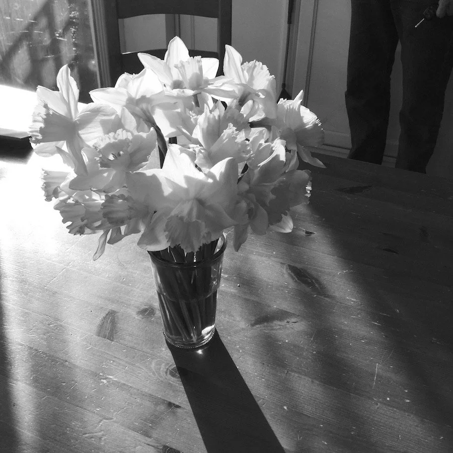
Picture of the week


TIPS
1 Look at the coloured image.
Break down the image into areas of light, mid and dark colours. Where are the lightest colours? Where are the darkest colours? Where are the colours in between?
2 NOW look at the B & W versions ( Scroll through the gallery using the arrows at the side of the picture)
Break down the image into areas of light, mid and dark tones. Where are the lightest lights? Where are the darkest darks? Where are the mid-tones?
3 Now ask yourself these questions:
Where are the darkest dark tones? Are they in the same place as the darkest colours?
Where are the lightest light tones? Are the highlights in the same place as the lightest colours?
Where are the mid-tones? Does their placement in the picture match where you bought the mid-colours were?
When you first look at the picture, are you aware of whether your eye is drawn first to the lights, the darks or somewhere in between?
Did you eye follow the same path across the image in the three different versions?
Were there areas where what you perceived to be two distinct colours merged into one patch where viewed in B & W?
Were hard edges in colour that became soft edges when looked tonally?
TOPIC of the Week: theme for the term
This term we will be looking again at tone. We will be looking (hard!) at how drawing can increase our awareness of tone. We will be also be considering tonal values across an image within a composition, and ways of increasing our understanding of the relationship between tone and colour.
Quote of the week
“If I could say it in words there would b no reason to paint.”
Edward Hopper
Gallery of the week

National Portrait Gallery, London.
National Portrait Gallery
This week we highlight the National Portrait Gallery.
Tucked in behind the National Gallery, you could almost miss it if you weren’t aware it was there. It is home to an astounding collection of portraits! From the old masters that have you staring at them in awe, to modern portraits that leave you questioning exactly what a portrait is, it is well Wirth a visit next time you are in the vicinity.
Or make a special trip! Rob and I were lucky enough to be in London recently when the David Hockney Portraits exhibition was on. When looking at each portrait invidiually it is easy to question Hockney’s style ; naive, loose, even a little clumsy maybe…how well does he capture a likeness? But standing in a room full of them…WOW! It becomes immediately obvious that he is an absolute master of capturing personality, perhaps the highest standard a portrait artist a can aim for.
The website is excellent, allowing you to explore not just the portraits currently display in London, but also around the world. And there is lots of information about special events , some of which can be joined online.
those of you who are fans of Sky Portraits Artist if the Year will appreciate being able to view some of the winning portraits, and also those in the collection painted by one of the judges, Tai-Shan Schierenberg. We were lucky enough to find his portrait of Seamus Heaney, and stood analysing his mark-making (did he use a 2inch household brush?) which was stunning.
Last updated: 11.12.23