SPRING Term week 5
Date: 11th & 12th February
Tutor : Siân and Rob
Harbour House : Art Studio
Tutor Led
what to bring
Your paints, brushes, kitchen roll ( please don’t forget some of this), and plenty of clean watercolour paper. The watercolour paper will need to be of good quality (e.g. Bockingford) as some of the techniques we will be doing will not work if we cannot lift paint. You will need enough surface area to cover at least 12 mobile (smart) phones :)
Also bring your collection of old or ‘failed’ paintings so that we can work on top of them.
THIS Week
We will be spending a great deal of time practising laying paint down and watching it dry this week! Does it get much more exciting than that?!
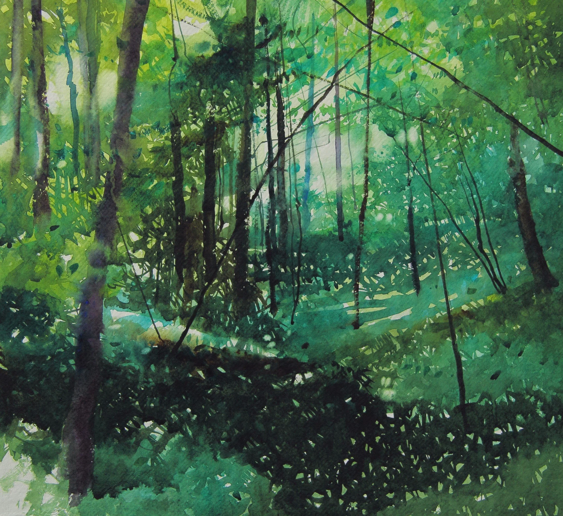
‘Patches of Light’ Watercolour Siân Dudley
colour of the Week
Lemon Yellow
A tricky one.
Just about every manufacturer has a colour called ‘lemon yellow’ . However, do NOT assume they are the same colour or pigment!
They appear to be almost identical as they exit the tube, but due to their different composition they can behave very differently when you are painting with them. Our investigations revealed that some manufacturers describe their ‘lemon yellow’ as transparent, some as semi-transparent and some as opaque. Once you have found a ‘lemon yellow’ the you like make sure you replace it with exactly the same one.
An awareness of the particular pigments that are used in your paints is very useful. You can usually find it on the tube of paint; sometimes you need to visit their website. Noting the pigment used is only a guide as other factors come into play, e.g. the secret recipe for the paint or the way the pigments are processed.
The Colour Index International is worth knowing about. Created in 1925 it provides a standardised system used by manufacturers all over the world. It is a hugely informative tool for artists. Jacksons have a fantastic explanation of the Colour Index international, with explanations of how it can affect the paints and how we choose to use them. This is well worth a read! No-one expects you remember it all, but raising your awareness of this system will help you yo understand how paint colours work.
Other useful geeky links about colour and pigment
Winsor & Newton ‘Composition and Permeance Tables’. A guide to the constituent pigments and behaviour of the I Professional watercolours.
‘Granulation in watercolour : What it is and how to Use it’ Yet another great guide by Jacksons Art.
‘homework’ challenge
Last week the homework challenge was to mix secondary colours attempting to match a manufactured secondary paint colour.
You could extend this exercise. What happens when you try using your mixed green, purple or orange in further mixes? How do your own mixes with the manufactured paints when using them in further mixes.
For example, ‘Transparent Orange” (Schimincke) makes some superb browns and grey when mixed with ultramarine, often a good substitute for burnt Sienna when a warmer mix is required. but when happen when you mix an orange that look very similar to Transparent orange using your own primary colours? Firstly ,can you get a similar orange colour? What happens when you mix your own version with ultramarine?
ArTIST of the week
David Parfitt
Quite simply one of our heroes, and an absolute master of glazing and layering techniques.
Take a few moments to spot the layers of paint in this painting. Amazing control, showing a deep understanding of how watercolour works.
Enough said, please visit his site David A Parfitt RI
CLASS NOTICEBOARD : Any new items to be added? please email details and they will be added by the following class.


