How to See Tone
This article first appeared in The Artists and Illustrators magazine, issue 295, January 2011
Due to the vagaries of the English language ‘tone’ as used by artists is an oft- misunderstood word, yet it’s meaning is very straightforward.
It simply refers to how light or dark a colour appears to be.
The importance of using the correct tonal qualities of a painting should not be underestimated. Get it wrong and your painting will appear to be flat and lifeless; get it right and your work will sing! In representational painting tone is essential in creating the illusion of form, space and depth; in more abstract paintings tonal variations can be used very effectively to lead the eye around the work creating movement and excitement. Yet the simplicity of its meaning belies the difficulties artists can experience in evaluating the tonal qualities of their subject matter. To accurately assess tone one must temporarily ignore texture, shape, detail and even colour. This is much easier said than done! Thankfully, there are ways of making the job easier.
Letting go of what we ‘know’ to be there is equally as important in evaluating tone as it is in drawing.
Due to the phenomenon known as perceptual constancy we can have difficulty in seeing what is actually in front of us. For example, in a room in which all the walls are painted the same colour we are aware that walls in shadow appear to be darker in colour than walls in bright sunlight. However, because we know that the paint on the walls is all the same colour we have a tendency to under estimate the difference.
In addition there are certain colours we perceive to be either dark (e.g. black, brown, purple) or light (e.g. white, pink, yellow). Be certain that you are not confusing colour and tone. In certain light a dark colour may need to be rendered as almost white in your painting; consider the shine on a conker. Similarly, in shadow the petal of a white flower may need to be rendered a very dark grey. Our perception is so strong that even when you have discerned the need to use these tones it can take courage to apply them to the painting.

Ask the right questions.
Temporarily ignoring major aspects of your subject can seem an anathema to the beginner, especially as one or more of these may be what inspired you to make the painting in the first place. Focussing your mind on looking for the lights (high values) and darks (low values) is an important first step in evaluating tone.
Instead of asking what shape the object is, ask how the lights and darks flow across its surface. It is perfectly possible to depict the form of an object simply by using gradated tonal marks without drawing a single line.
Instead of searching for detail, ask whether some detail is difficult to see because it is in an area of shadow. This can be helpful in avoiding painting what you ‘know’ to be there, and also in introducing some interest to the composition in terms of lost and found edges.
Instead of asking what colour it is, ask first where the area being considered sits on the tonal scale before asking where it sits on the colour spectrum. The tonal scale ranges along a gradation from black to white, and all colours have an equivalent somewhere along that scale.
As you practice this approach you will you become aware of occasions when it was the actually the play of light on the subject that initially inspired you. You will start looking for tonal contrasts in the world around you, and begin to consider the play of tonal contrasts within a piece as an essential part of the composition.
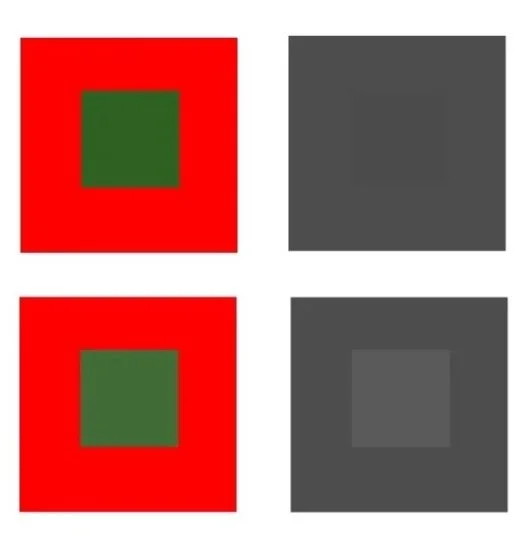
RED AND GREEN SQUARES
Take a look at the red and green squares shown here. The colours you perceive as being very different may actually be extremely close on the tonal scale. A slight variation in ‘colour’ (tone) as shown in the lower red and green square can make a big difference to your painting.
Overcoming Perceptual Constancy
Artists need to overcome perceptual constancy if they are to use the correct tone in their painting. So, how do we learn to see what is there, rather than what we know to be there? What follows are a few tips for learning to evaluate the tonal variation within your subject, some of which may be familiar to you.
Try screwing your eyes up and looking through your eyelashes.
This will effectively reduce the mid-tones, leaving the darks and lights. I sometimes use this method to assess where the very brightest brights and the darkest darks are, but I’m not a great fan of looking at things with my eyes shut. I find it OK as a method of giving myself an overview, but it hinders my ability to define the subtleties of variation in the mid-tones.
A digital camera can be a very useful tool.
Firstly, look to see if it has an option to view the LCD screen in black and white. If so, set the camera to this option when viewing your subject. This is a particularly easy way of viewing your subject in terms of tonal values, removing what is often the confusing issue of colour.
By adjusting the exposure (EV compensation) you can alter the difference between the light and dark areas. While this may not give you a great photo for reference, comparison between the different settings can raise your awareness of tonal variations across your subject.
Comment from Siân 2025 “Using a camera to assess tone as become much easier since I wrote this article in 2011 ! Smartphones have made a huge difference, giving us the opportunity to asses tones very quickly using the camera. Learn how to use your phone camera to take photos in black and white, or how to edit a colour photo to change it to black and white.”
Add a black and white photograph of your subject to your reference material.
While I would not advocate using a photo instead of observational sketches, but used alongside they can be extremely useful. If your camera does not have an option to take black and white photos simply print in greyscale, or photocopy the colour photograph.
Compare colour with black and white photographs of the same subject.
You may find you have some surprises in that what you perceived to be a dark colour may actually have a high tonal value. While you are learning to ‘see’ tone, using a photograph for this avoids having to battle with changing light conditions!
If your painting is looking flat, the chances are that the tonal values are incorrect. Try any of the above methods to view your picture in monotone. It will quickly become obvious where you need to lighten or darken your picture. Do this as your painting progresses, giving yourself plenty of opportunity to make adjustments. When using the camera and photographs like this, do not forget to keep looking back and comparing what you see through the camera with what is in front of you. Over time, you will learn to see the tonal values without the aid of the camera.
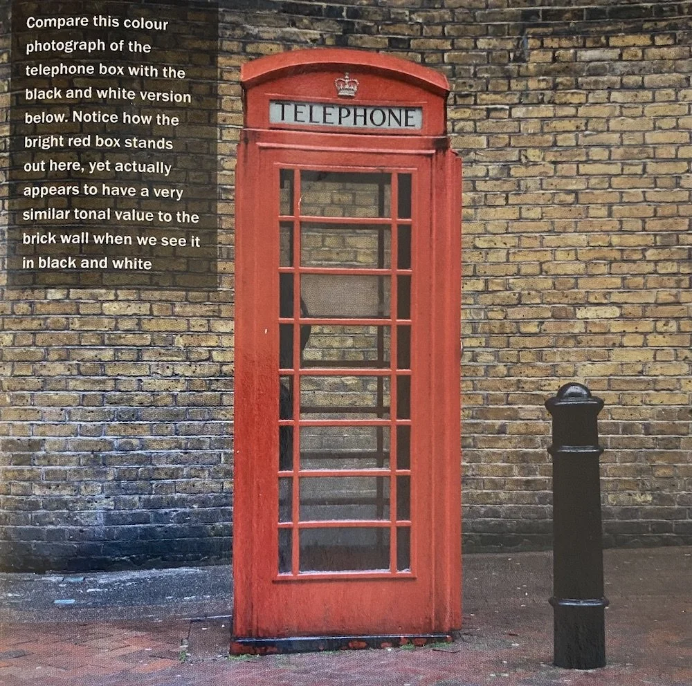
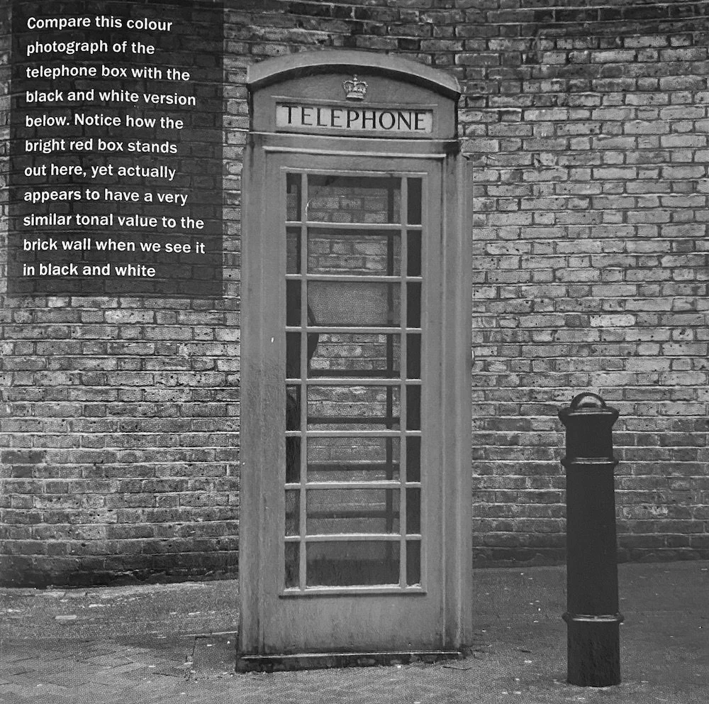
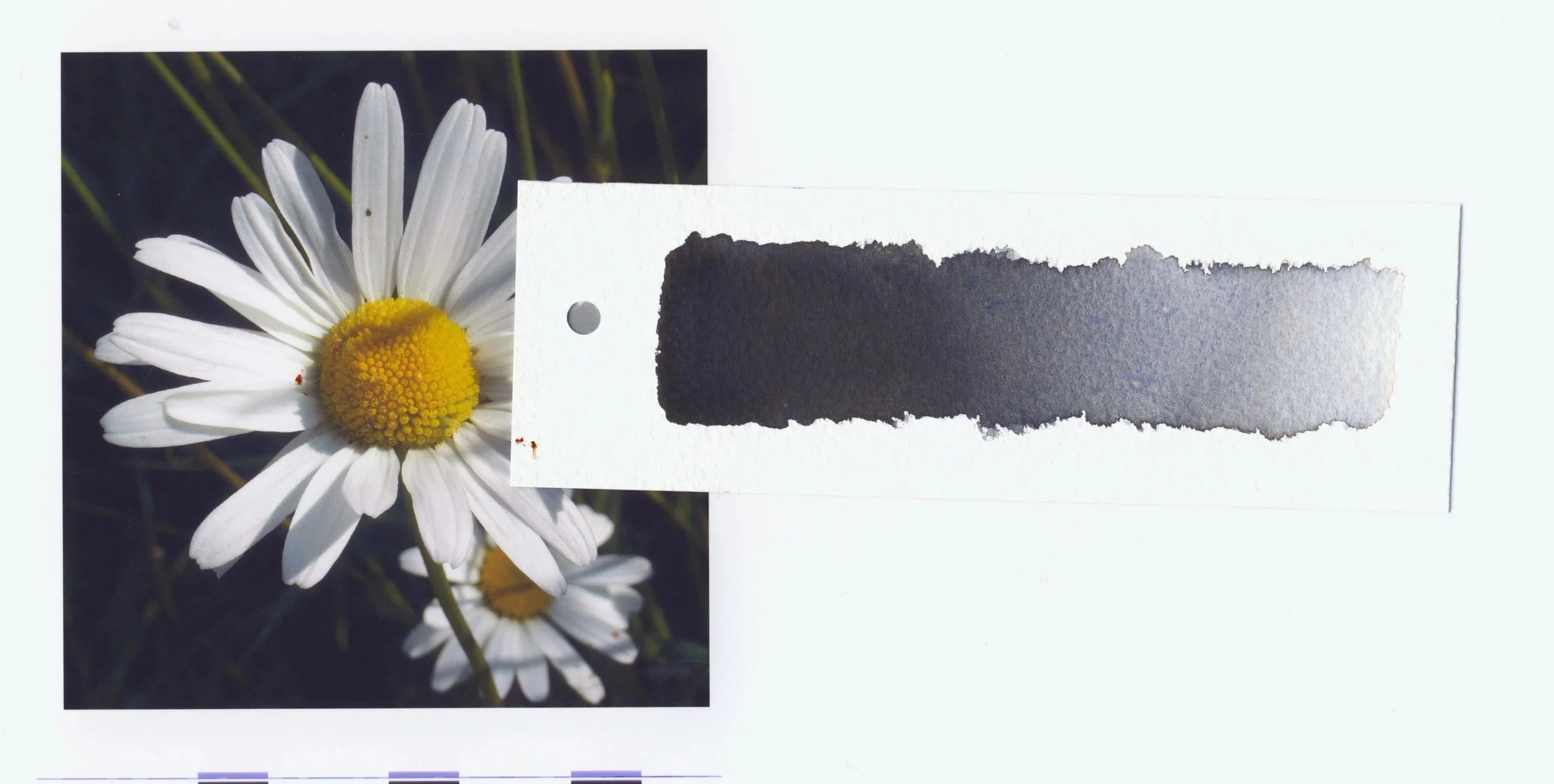
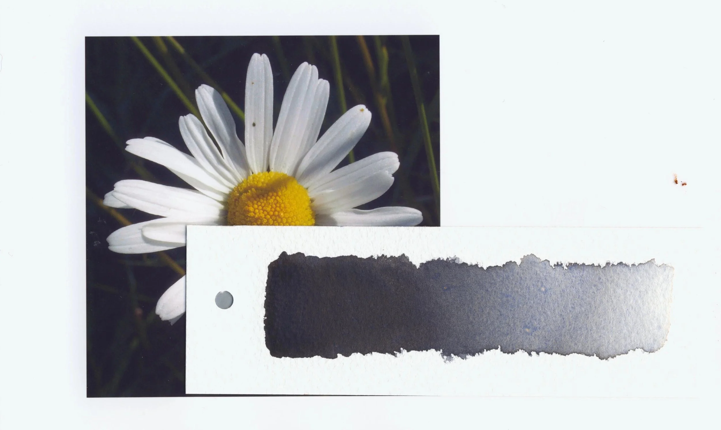
Look at how the telephone box stands out against the wall in colour. When viewed in black and white we can see that they are much more similar in tone than we perceive at first.
Isolate areas of the subject.
The Tonal Indicator TooL
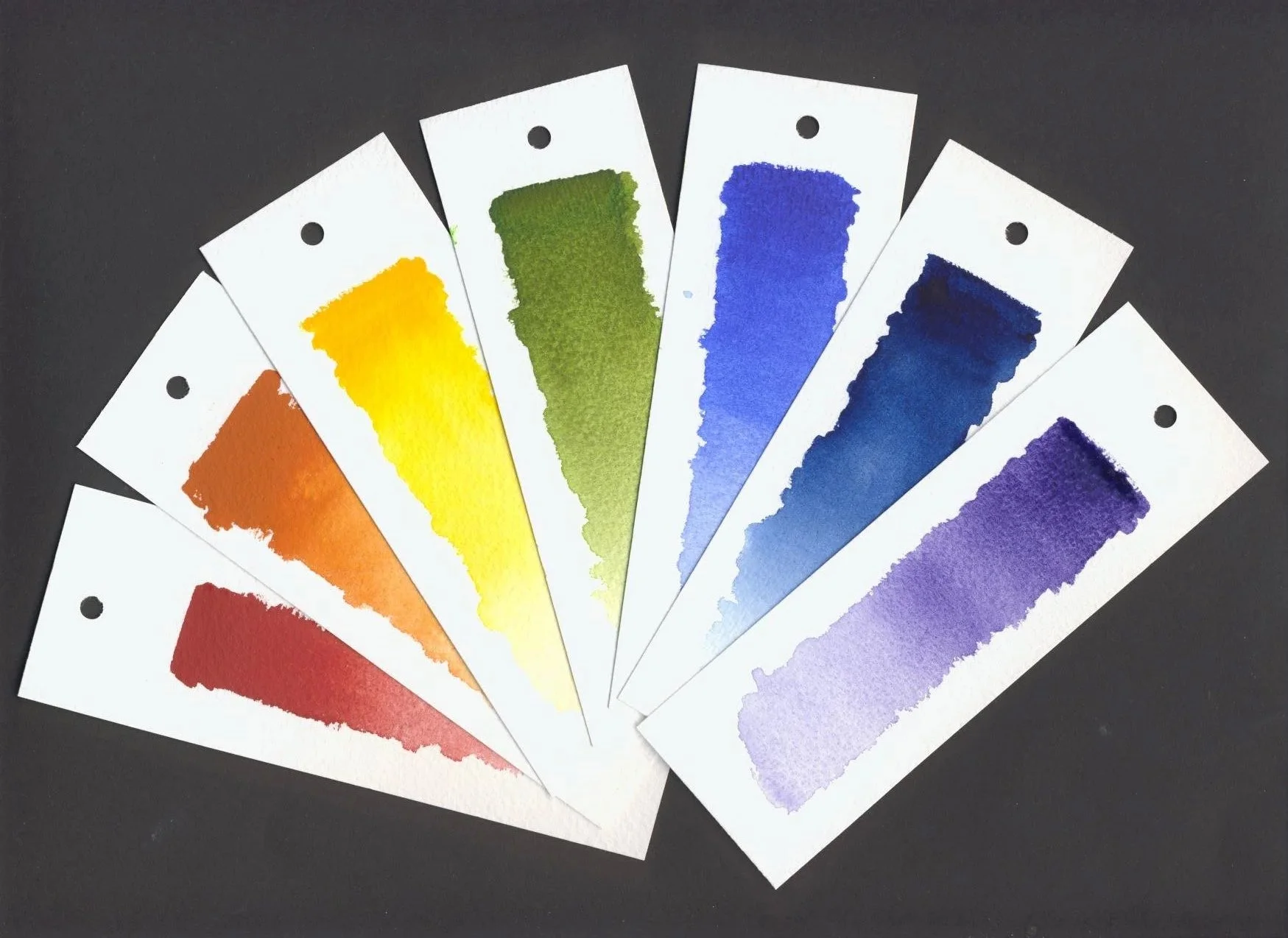
It is possible to overrule perceptual constancy and our perceptions about colour by isolating small areas of your subject. By taking an area out of context your brain your brain is fooled into breaking any associations it might have with the subject as a whole, and perceives it for what it is – a spot of colour and/or tone.
I have a developed a tool I light-heartedly call a Tonal Indicator Tool (T.I.T.), which many of my students have found very useful. This is simply a strip of paper with a hole at one end! (The T.I.T. is also useful for identifying colour). The hole is made with an office hole punch, which seems to be a very good size for this purpose.
Instructions
Close one eye.
Hold the T.I.T. at arms length. It is important to hold it at arms length to reduce your field of vision to a tiny spot; otherwise you gain nothing!
Look through the hole at the subject.
Assess the tonal quality of the spot you are looking at. Is it a dark, mid- or light tone? Also ask yourself whether what you are looking it lighter or darker than you expected it to be; this can produce some surprises!
Use the tool to view a different ‘spot’ of your subject. After assessing the tone of this new area, compare it to the first spot that your considered. Is it lighter or darker, and, importantly, by how much?
The tones/colours you are seeing through the hole are the ones you need to use in your painting. If you switch between looking at your subject through the T.I.T and directly you will probably notice how the tonal contrasts diminish as your brain re-adjusts to processing the whole subject, rather than just the isolated spot.
Be brave! Those are the tones you need, even if they seem too dark! Don’t forget that when your viewer sees the picture as a whole they will read the image as a whole, their brains making natural adjustments again.
It sometimes helps to paint a gradated strip on one side of your strip of paper (see image above), either in B & W or in a relevant colour, with which you can compare the spot of colour you are seeing.


This tool can also be used with your reference photograph, this time by placing the hole directly in contact with the photograph. Again, you will only be able to see a small spot, and it is very easy to see how light or dark that spot is. By moving the hole around over the photograph it is extremely easy to compare the tones as they vary across your subject. When used like this is it particularly useful for assessing tones of adjacent items within your composition.
Students often fail to notice ‘lost’ edges: where they know a hedge to finish against a path they will paint the two in different tones, even though a shadow across the scene might be making the edges indistinguishable. By observing this point through the small hole, they are able to see that, due to the similarity in tone, the edges are indistinguishable.
If your painting is looking flat you can also use the tool in contact with your painting (making sure it is dry first!). Using the T.I.T. to compare your painting with your reference material you will be able to spot the differences and make the necessary corrections.
17.19.2025 An edited version of this article can be seen on the Artists and Illustrators website CLICK HERE
Further information
To make your own Tonal Indicator Tool here are a few tips to ensure success.
Use a piece of paper stiff enough that it can be held upright without flopping. A scrap piece of watercolour paper (300gms) works very well.
When using a hole punch to make the hole make sure that there is enough of a ‘border’ around the hole to isolate the spot of tone or colour. too close to the edge of the paper don’t isolate the spot enough.
No hole punch? Cut a small hole ( any shape) with a scissors. Make sure it is small enough. The hole punch sized hole is perfect. Too big a hole means you see more of the subject, putting the subject back I to context and allowing perceptual constancy to maintain its grip on your brain.
Keep in mind that painting a strip if tones or colour might be distraction. If you prefer to do this make a new T.I.T for each painting using the palette of colours you have chosen for that piece.